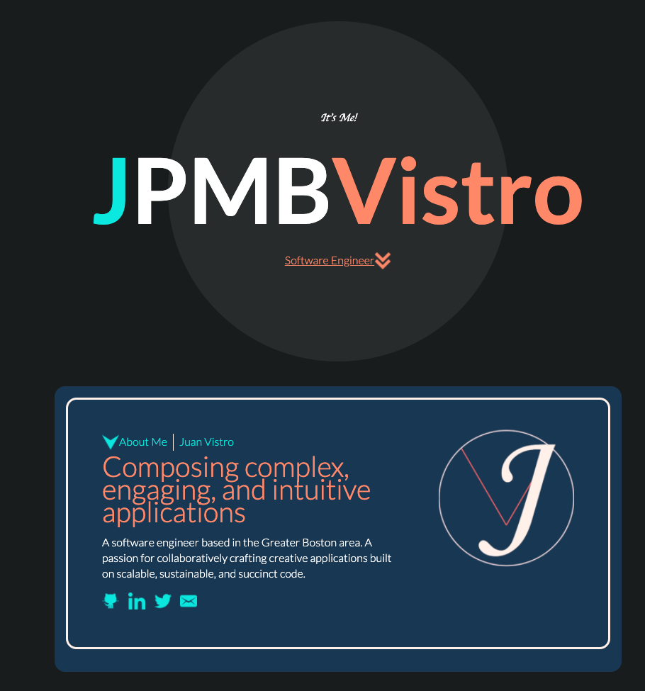
The second iteration of the portfolio you see here...
I wanted to be sure to include the site itself in my portfolio. Custom made, without a template, using HTML, CSS, and Vanilla JS. I wanted to streamline my portfolio from its previous iteration, focusing on my work as a software engineer and including some interactive elements.
The header includes a mouse-over animation that expands my the initials in my handle to their respective names. The animation is a call back to my experiences having to pare down my name as its fairly long. My name already reflects my culture's complex relationship with colonization as each of my names are Hispanic in origin. I decided that this portfolio would be an approppropriate means of sharing my full name without being the focal point of the site.
When choosing how to display my technology stack, I was tempted to display a percent bar indicating my percieved ability/proficiency with each of the technologies. I found this a little confusing and misleading. Is my proficiency with a particular piece of technology measure by my application of it or my comprehension of it? And are these measurements in relation to each other? This suggests I am the least proficient in something, but that visualization might be misconstrued as in competance while in fact I might be very competant with it but just not as so as with my other skills. If you would like to know what I am proficient in, and what I am not, this portfolio should provide a better indication.
My favorite part of building this has been building the masonry layout of my works. I wanted a way of displaying my work that was fun and interactive, showcased my knowledge of complex layouts built with advanced CSS and JS features.
Special credit goes to Jesse Breneman and Andy Barefoot whose articles helped build the hex grid and masonry layout respectively.
